Q & A: Understanding Color

Understanding color

Understanding color

To better understand color in a space, you must first understand your relationship with color. For me, color has always been part of my surroundings. Being from a Caribbean family of Haitian descent, I have always had a love for color. Whether it was handmade Haitian wooden carvings stained in rich, dark tones or paintings of the Caribbean landscape hung on the walls — color, in my eyes, had a way of adding richness, depth, and life to the simplest things!

Today as an interior designer, I have a deep appreciation for color that goes deeper than what looks beautiful in a space. When dealing with color, I often think about how it makes one feel, think, and behave. I believe that color can evoke emotion and change the perception of a space or thing.

I recently asked a few friends, past clients, and various professionals about their relationship with color and how color affects their lives. I asked questions like, Do you like color? Are you scared of it or drawn to it? What is your favorite color and why? Is your current home decorated with color? The responses fascinated me. I spoke to one person who grew up with collections of art in their home and certain colors bring back memories for them. Most of who I spoke with were not scared or intimidated by it, they actually LOVED color! For some, colors like purple give energy and scream happiness, for others colors like teal gives a sense of calm while others love yellows and reds because it brings joy to life! However, what was interesting to me was that although they loved color and were not scared of it some of them did not decorate with it.

To dive even deeper I went to my friend and color expert Michele Charles Gustafson, BComm, CIC. Michele is a Certified Image Consultant, Color Expert, and International Confidence Coach. I first met Michele on my podcast Coffee n Tea with S & L, and I loved her perspective of color and her explanation of how each of us uses color differently.

Michele Charles Gustafson, BComm, CIC

Michele Charles Gustafson, BComm, CIC

Sabine: How can color specifically bring out one's personality?

Michele: Color is an element of personal, emotional expression. When done well, color doesn't bring out one's personality; it reflects its truth. Every color has an expression of a character value, aspiration, intent, and action. When one learns to read color in this way, they can match it to their environment from their homes to offices, wardrobes, and personal branding.  

For example, blue isn’t just one blue. Teal, cobalt, cornflower, or cerulean all have distinct values, aspirations, intents, and influences to action. While general color psychology says blue is about trust, the difference in quality and characteristics of a blue will change it from calming trust to persuasive trust to connective trust -- all are different blues.

Sabine: Sometimes colors have the power to affect our mood.  With so many options to choose from, how can we be intentional with our choice of color(s)?

Michele: A big question. Color ALWAYS affects mood. The best way to be intentional is to be aware that color is an art and a science. There is a reason why certain hues draw you in - most people don't know why, though.

The colors that make you feel comforted, at peace, or even powerful have characteristics in common. They are, though you may not be aware, usually fall into groups in your personalized color palette. Once you understand the particular color characteristic in common with the colors that catch your intuition, know that there are more than 30 other complementary hues that can give you new and exciting ways to express yourself. Each color coordinates seamlessly with each other, and all can move between your interior decorating, to your wardrobe, to your mobile phone case -- and with every detail, the expression will feel "like you." 

“We are people. We have things to say with our lives, using color in a personal way can help us express it no matter how blank the canvas, the trends of the day, or the influences around us.”

—Michele Charles Gustafson

Sabine: Do you feel that it's important to balance color with neutrals?

Michele: Neutrals are a must to balance the intensity, activity, and emotional power of any hue, but know, that neutrals carry messages too. Every shade of grey doesn't mean the same thing; every tint of cream doesn't offer the same emotion. Combining hues and neutrals from a complementary color palette adds a fuller range of emotion and intention to any palette combination.

The color psychology of using all neutrals is limited, in my opinion. Even in a modern or minimalist aesthetic, there is always room for some tint, tone, or shade of a hue. We are people. We have things to say with our lives, using color in a personal way can help us express it no matter how blank the canvas, the trends of the day, or the influences around us. 

Michele teaches entrepreneurs, professionals and community-builders to use her Hue and Style® process to turn how they show up into a permanent superpower for personal branding, visibility, and new success. Find her online and socialize with her on Instagram, Facebook, and Twitter. Share in the comments below your relationship with color.

À la prochaine,

 
signature copy.jpg

Bring Summer into your Home with These Lively Colors

Summer Colors for the home

Summer Colors for the home

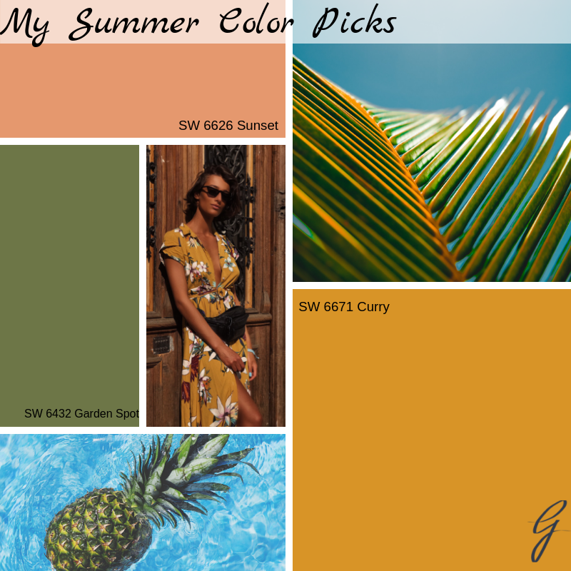
Summer is in full gear and that means bright, organic colors that remind us of the outdoors. I am personally a fan of rich color tones blended with soft neutrals and this summer my color picks are inspired by fashion, tropical foliage, and the different shades of a sunset.

My-summer-color-picks.png

SW 6626 Sunset is a beautiful, bright orange with a slight peach undertone. This warm color pairs nicely with a soft off-white neutral yet can contrast with a deep green such as SW 6432 Garden Spot.

SW 6432 Garden Spot is a fresh, organic green-leaf color that is sure to blend with any color palette this summer. Add this cool color to contrast against the warm SW 6626 Sunset or SW 6671 Curry tones. If you prefer a neutral color palette use this rich green as an accent color against your crisp, clean white decor.

SW 6671 Curry is a warm punch of color that will spice up any room or space this summer. This golden, yellow color contrasts perfectly with SW 6432 Garden Spot or a rich teal color.

Pull inspiration this summer from what’s around you to get started. Some great inspiration sources are nature, your wardrobe, artwork, magazines and Pinterest of course.

If selecting colors for your home that reflect your style sounds overwhelming, exhausting or even impossible try my online Paint Color Suggestion service. For a flat rate I will select a complete color palette that will have your guests saying “Wow!”.

À la prochaine,

 
signature copy.jpg

Fall Colors to Enhance your Home

The change of seasons always brings new color palettes, textures and designs. I love the fall season because it adds a sense of warmth and comfort to our homes.

1.png

It’s time to add some fall accents and one way of doing that is with incorporating fall colors into your overall color palette. The beauty of creating a color palette is the versatility it has. Here are some of my favorite colors this fall.

2.png

Plum Brown has a dramatic depth to it. Use this rich eggplant color on your walls with white trim work or wainscoting in a dining room, powder room or bedroom. This color pairs well with Rookwood Amber for a beautiful contrast.

Rookwood Amber is a great warm color to add to your palette this fall. It’s an earth tone color that can be incorporated in a pillow design, window treatments, plants (like mums), artwork or even a fall tabletop accessory (like a pumpkin).

Forestwood brings the fall outdoor colors indoors. This color is inspired by colors found in nature. This deep, rich green is a perfect choice to use in your pillow decor, accent throw or fall bedding.

Santorini Blue can be considered an unexpected fall color tone but this teal base color contrasts beautifully with Rookwood Amber and Plum Brown. It’s the perfect color to add chic and style to a space.

What I love most about these colors for fall are the rich tones in each color. Whether you decide to use these colors together in a palette or separately as an accent to your existing colors they are sure to enhance the overall decor of your home.

What are some colors you are using in your home this fall and what do you love about them? Share in the comments below.

À la prochaine,

 
signature copy.jpg

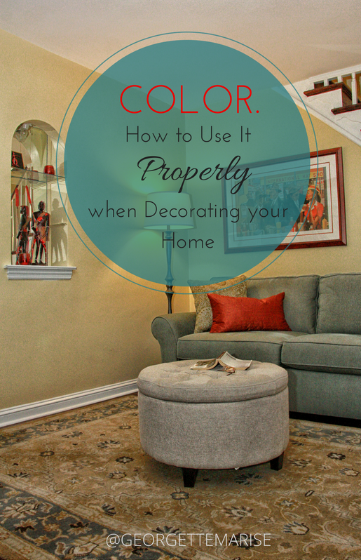
Color. How to Use it Properly when decorating your home.

Color! Some people are terrified of it and others LOVE it! Where do you fall? As an interior designer my clients require guidance on how to apply the appropriate color palette for their home. In most cases, it is common for people to feel overwhelmed when selecting colors on their own to decorate a space.  Color affects your mood and your perception of a space or object.

"Let's embrace your comfort level with color and learn how to incorporate it into your home." 

using color correctly.  PAINT: SW 6379 JERSEY CREAM

using color correctly.  PAINT: SW 6379 JERSEY CREAM

Develop a Palette. Every space needs a color palette. A color palette is an index of all the main colors that are selected for the room.  When developing a color palette first decide on which color will be the primary color in the space. I suggest compiling three to five different colors for your space. Let’s create a scenario using a color palette that consist of teal and rust. A great color to add to the palette would be a neutral color, a latte or a butter yellow to balance the two main colors. 

Choosing your Colors.  Ever go to a paint store to find a color to paint your room and feel lost? The good news is that you will only need 3 or 5 colors for your palette. A good exercise when deciding on colors is to find out what colors inspire you and use them in layers. A trade secret that professionals use often is selecting a primary color for the main walls, a secondary color for an accent wall, and a third color for details such as ceiling paint options.

If you are having a hard time finding inspiration flip through some decorating magazines, browse online or take a trip to a furniture showroom to get some ideas on color combinations that they use and make sure to talk to your interior designer to get a professional opinion on colors you selected for your space. If your inspiration piece has more than 5 colors, choose 3 to 5 of those colors to incorporate in your room.

Using Layers of Color. Once you have determined your color palette, you need to make sure that you have light, medium, and dark colors throughout your palette. Your colors can come from your paint, flooring, furniture, or accessories. You might have a color palette that has 5 different colors that compliment each other and has a hint of warm or cool, but if all 5 colors are the same tone or shade this creates a flat, uninteresting color palette. Even if your room were to consist of one color in order for everything in the room to not camouflage you will need to create a palette with light, medium, and dark tones.

"Making sure your palette has light, medium, and dark tones creates dimension and interest to any room."

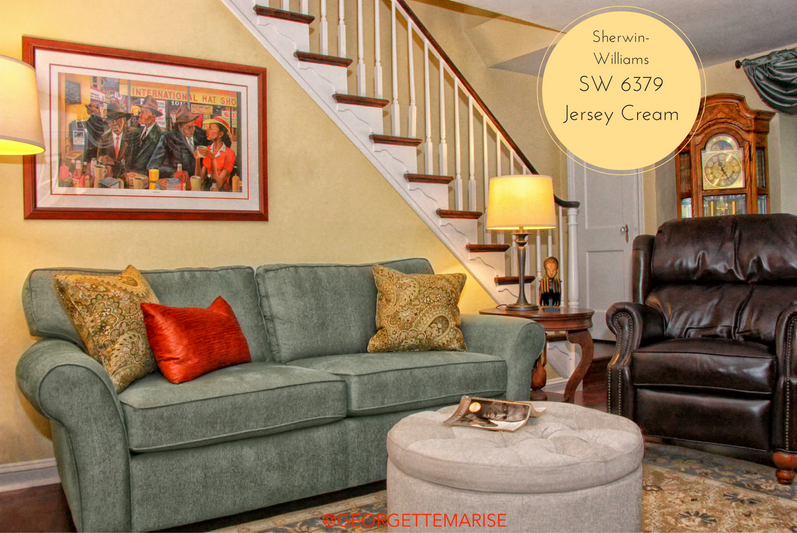
I used a mixture of light, medium and dark colors to create a well balanced color palette. Paint: SW 6379 Jersey Cream

I used a mixture of light, medium and dark colors to create a well balanced color palette. Paint: SW 6379 Jersey Cream

In this townhouse living room, I used the lighter tones on the walls, ceiling, ottoman and the area rug.  The medium color tones were used in the sofa, pillows and window treatments, and I used the darkest tones in the leather recliner and the wood floors.

Color is an essential piece to decorating and designing any room. It will affect how you see and feel in a room. Using the proper amount of colors creates layers of interest in a space.

USE YOUR COLOR PALETTE.

USE YOUR COLOR PALETTE.

Are you still feeling stuck with what colors to use on your walls? Are you worried about making a mistake? Choose my Paint Color Suggestions service today and get hand picked color options perfect for your space. Don't forget to leave your comments below.

Here's to decorating with color!