Q & A: Understanding Color

Understanding color

Understanding color

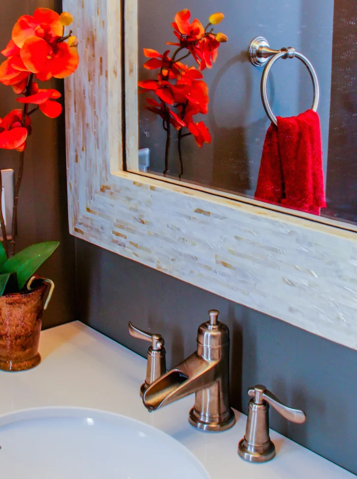
To better understand color in a space, you must first understand your relationship with color. For me, color has always been part of my surroundings. Being from a Caribbean family of Haitian descent, I have always had a love for color. Whether it was handmade Haitian wooden carvings stained in rich, dark tones or paintings of the Caribbean landscape hung on the walls — color, in my eyes, had a way of adding richness, depth, and life to the simplest things!

Today as an interior designer, I have a deep appreciation for color that goes deeper than what looks beautiful in a space. When dealing with color, I often think about how it makes one feel, think, and behave. I believe that color can evoke emotion and change the perception of a space or thing.

I recently asked a few friends, past clients, and various professionals about their relationship with color and how color affects their lives. I asked questions like, Do you like color? Are you scared of it or drawn to it? What is your favorite color and why? Is your current home decorated with color? The responses fascinated me. I spoke to one person who grew up with collections of art in their home and certain colors bring back memories for them. Most of who I spoke with were not scared or intimidated by it, they actually LOVED color! For some, colors like purple give energy and scream happiness, for others colors like teal gives a sense of calm while others love yellows and reds because it brings joy to life! However, what was interesting to me was that although they loved color and were not scared of it some of them did not decorate with it.

To dive even deeper I went to my friend and color expert Michele Charles Gustafson, BComm, CIC. Michele is a Certified Image Consultant, Color Expert, and International Confidence Coach. I first met Michele on my podcast Coffee n Tea with S & L, and I loved her perspective of color and her explanation of how each of us uses color differently.

Michele Charles Gustafson, BComm, CIC

Michele Charles Gustafson, BComm, CIC

Sabine: How can color specifically bring out one's personality?

Michele: Color is an element of personal, emotional expression. When done well, color doesn't bring out one's personality; it reflects its truth. Every color has an expression of a character value, aspiration, intent, and action. When one learns to read color in this way, they can match it to their environment from their homes to offices, wardrobes, and personal branding.  

For example, blue isn’t just one blue. Teal, cobalt, cornflower, or cerulean all have distinct values, aspirations, intents, and influences to action. While general color psychology says blue is about trust, the difference in quality and characteristics of a blue will change it from calming trust to persuasive trust to connective trust -- all are different blues.

Sabine: Sometimes colors have the power to affect our mood.  With so many options to choose from, how can we be intentional with our choice of color(s)?

Michele: A big question. Color ALWAYS affects mood. The best way to be intentional is to be aware that color is an art and a science. There is a reason why certain hues draw you in - most people don't know why, though.

The colors that make you feel comforted, at peace, or even powerful have characteristics in common. They are, though you may not be aware, usually fall into groups in your personalized color palette. Once you understand the particular color characteristic in common with the colors that catch your intuition, know that there are more than 30 other complementary hues that can give you new and exciting ways to express yourself. Each color coordinates seamlessly with each other, and all can move between your interior decorating, to your wardrobe, to your mobile phone case -- and with every detail, the expression will feel "like you." 

“We are people. We have things to say with our lives, using color in a personal way can help us express it no matter how blank the canvas, the trends of the day, or the influences around us.”

—Michele Charles Gustafson

Sabine: Do you feel that it's important to balance color with neutrals?

Michele: Neutrals are a must to balance the intensity, activity, and emotional power of any hue, but know, that neutrals carry messages too. Every shade of grey doesn't mean the same thing; every tint of cream doesn't offer the same emotion. Combining hues and neutrals from a complementary color palette adds a fuller range of emotion and intention to any palette combination.

The color psychology of using all neutrals is limited, in my opinion. Even in a modern or minimalist aesthetic, there is always room for some tint, tone, or shade of a hue. We are people. We have things to say with our lives, using color in a personal way can help us express it no matter how blank the canvas, the trends of the day, or the influences around us. 

Michele teaches entrepreneurs, professionals and community-builders to use her Hue and Style® process to turn how they show up into a permanent superpower for personal branding, visibility, and new success. Find her online and socialize with her on Instagram, Facebook, and Twitter. Share in the comments below your relationship with color.

À la prochaine,

 
signature copy.jpg

Bring Summer into your Home with These Lively Colors

Summer Colors for the home

Summer Colors for the home

Summer is in full gear and that means bright, organic colors that remind us of the outdoors. I am personally a fan of rich color tones blended with soft neutrals and this summer my color picks are inspired by fashion, tropical foliage, and the different shades of a sunset.

My-summer-color-picks.png

SW 6626 Sunset is a beautiful, bright orange with a slight peach undertone. This warm color pairs nicely with a soft off-white neutral yet can contrast with a deep green such as SW 6432 Garden Spot.

SW 6432 Garden Spot is a fresh, organic green-leaf color that is sure to blend with any color palette this summer. Add this cool color to contrast against the warm SW 6626 Sunset or SW 6671 Curry tones. If you prefer a neutral color palette use this rich green as an accent color against your crisp, clean white decor.

SW 6671 Curry is a warm punch of color that will spice up any room or space this summer. This golden, yellow color contrasts perfectly with SW 6432 Garden Spot or a rich teal color.

Pull inspiration this summer from what’s around you to get started. Some great inspiration sources are nature, your wardrobe, artwork, magazines and Pinterest of course.

If selecting colors for your home that reflect your style sounds overwhelming, exhausting or even impossible try my online Paint Color Suggestion service. For a flat rate I will select a complete color palette that will have your guests saying “Wow!”.

À la prochaine,

 
signature copy.jpg

Using Art to Create a Color Palette

As an interior designer, I believe that developing a color palette for your space is crucial to achieving a successful design. Whether you are using monochromatic, complementary, or contrasting colors it's important to define the role that each color in your palette has. If you are having a hard time developing a color palette, draw inspiration from something that already has a color palette like a piece of art.

using art to create a color palette

using art to create a color palette

Art is a great way to develop a color palette because it already has a collection of colors, tones, and shades that you can draw from throughout your room. Let's take a look at a formal living room I designed for a client and how I was able to pull colors from the custom artwork to design the entire room.

This living room included 4 original artwork pieces I had an artist create just for this project. All of the individual art pieces were uniquely different but shared the same colors. The colors inspired me to develop colors for the window treatment fabric, accent pillows, area rug, tabletop accessories, walls, trim, and even the ceiling.

formal living room paint color

formal living room paint color

color palette

color palette

Once you determine which colors from the artwork you want to incorporate in the design section them into categories (e.i. main color, secondary color, accent color, etc). This will help you determine which colors will be used the most and which colors will be used to complement the main color. In this living room the blueish, teal color was the "main color" and the soft browns, tans, and creams were "secondary". Lastly, the reds and purples were "accent colors" used in the pillows and the centerpiece. Each color was carefully selected for a particular role in the living room. 

coffee table centerpiece

coffee table centerpiece

Leave a comment below and share where you create your color palette from? Maybe you are asking "How do I find the right artwork?" or "I'm scared I will choose the wrong color?". Let me help, contact me directly at sabine@georgettemarise.com to start on your personal color palette for your room!

À la prochaine,

 
signature copy.jpg

Refresh Your Space With These Spring & Summer Paint Colors

Spring is finally here and it's time to refresh, spruce up, and brighten up your palette! If you are scratching your head around one particular room and don't know how to give it a little change, try upgrading the paint color on the walls and ceiling. 

Sometimes all your room needs is a redesign of the space. Painting is the fastest and most cost effective way to makeover a room without changing the furniture. It has the power to change the tone and mood of your space. Selecting the RIGHT paint color for your room is the biggest challenge my clients have. If you are looking to refresh your room try one of these colors this spring and summer to create an inviting space that you and your guests will enjoy.

My top Paint Color Picks for this Spring and Summer. 

My top Paint Color Picks for this Spring and Summer. 

If you would like to freshen the look of your room this spring but don't know what color would work best for your space, I recommend starting with my online Color Suggestions service to save you time, energy and headache. CLICK HERE.

Comment below with your favorite Spring/Summer paint color choices. Can't wait to see them!

À la prochaine, 


5 Reasons How Paint Can Transform a Room

Painting your walls can change your space for the best or the worst. I love to walk into a space and feel comfortable, excited, happy, relaxed, or even surprised! The reason why I can have those feelings when I walk into a space is because something as simple as a wall color can play a large role in designing a successful room. One of the largest structures in a room are the walls and painting them the right color can MAKE or BREAK the design of your room. 

Have you ever chosen a wall color then paint your walls, place all the furnishings back into the room and feel like you're in a different room? That's because color is one of the most important elements in interior design. I decided to focus on 5 reasons paint can transform your room to a new level visually.

"Choosing the right color, finish, or pattern for your room is key to transforming your space."

1. Creates a Backdrop. Since walls are one of the largest structures in your room, painting them will make a dramatic difference in how your room looks. Design Tip: If prefer to not have the walls the focus of your room then I suggest painting them a neutral color or even white. This will create a backdrop for your key pieces (e.i. artwork, pillows, accent furnishings) to shine. White walls are always a great option if you prefer a fresh, clean look.

2. Adds Pattern and Texture. If you like the idea of adding a focal wall or want to highlight a surface like the floors, ceilings or a column then using a faux finish or special technique with paint can allow you to create a custom pattern or texture that no one else will have. Be sure you consult with your interior designer and paint specialist first. 

A professional faux finisher created a leather-look pattern with paint.

A professional faux finisher created a leather-look pattern with paint.

3. Adds Contrast. A successful room design includes visual interest. Nothing adds more visual interest than contrast. Even if you have a monochromatic color palette, add contrast by using a darker wall color than your floor surface. This will add a layer of interest to the design of your room.

We gave this master bedroom a slight contrast by painting a darker hue on the focal wall.

We gave this master bedroom a slight contrast by painting a darker hue on the focal wall.

4. Adds Color. Color has the power to affect your emotions. It's a good idea to take some time and determine how you want to feel in your room. Warm colors can make a space feel cozy, exciting, playful, and energized. Whereas, cool colors can make a space feel relaxing, soothing, and peaceful.

5. Freshens a Room. A fresh coat of paint is a quick and easy way to liven or freshen your room. New painted walls have a clean and bright layer of finish to them that will add a new look to your room.

If you are frustrated trying to choose a paint color for your room or don't know what will look great with your existing design, this is your time to get your PAINT CONSULTATION for a flat rate! This will save you TIME & HEADACHE. I will choose the right paint color and finish for your walls that will have your guests impressed with your NEW room! Plus your painter will be excited that you finally made a decision! GET STARTED BY CLICKING>>>HERE.

Here's to beautiful colored walls!


P.S. Not located in the Tri State area? No worries, Paint Color Suggestions is an online service offered at a flat rate per room. 

3 Dramatic Paint Colors for your Powder Room that will Impress Guests

As a designer I always guide my clients when it comes to selecting paint colors. It’s a big decision! Picking the wrong color can ruin the design of a room. There’s usually one room in the house that will allow you to be bolder than usual…the Powder Room! A powder room is a small room for guests to freshen up privately. 

Even if you have an open concept home, your powder room can have a slight edge to the overall design of your home because it’s a room of its own. These are some dramatic paint colors that will have your holiday dinner guests saying “Wow, that’s nice! What is that paint color?”

1. Moody Blue by Sherwin Williams

If you are looking for a deep yet relaxing color for your powder room than Moody Blue is a great option. It's a cool tone that pairs well with a mixture of finishes. In this powder room we drew the paint color from the accented blue in the chocolate towels. That allowed us to add some bronze and gold from the accessories to balance the Moody Blue walls.

Sherwin Williams SW6221 Moody Blue

Sherwin Williams SW6221 Moody Blue

2. Dovetail by Sherwin Williams

Dovetail is a great paint color option if you are looking to achieve an urban or transitional style powder room. It's a rich gray that pairs nicely with lighter tones and bright accents. In this powder room we complimented the gray with orange orchids, rust colored towels, and a white/ivory mother of pearl mirror.

Sherwin Williams SW7018 Dovetail

Sherwin Williams SW7018 Dovetail


3. Expressive Plum by Sherwin Williams

Expressive Plum is a deep violet with a hue of gray, a cool blue, and a small hint of red. It is a great option in a traditional or transitional style powder room. It pairs nicely with white fixtures and chrome hardware to add a classic look. This color pairs well with warm grays, blues, rustic orange, or fiery red accents.  


sherwin williams sw6271 expressive plum

sherwin williams sw6271 expressive plum

With these options you are sure to impress your guests! 

 
Sabine

Still feeling overwhelmed? Need help picking out the perfect color for your space? No worries, purchase our Paint Color Suggestions TODAY to get your project started! Click here.

Follow